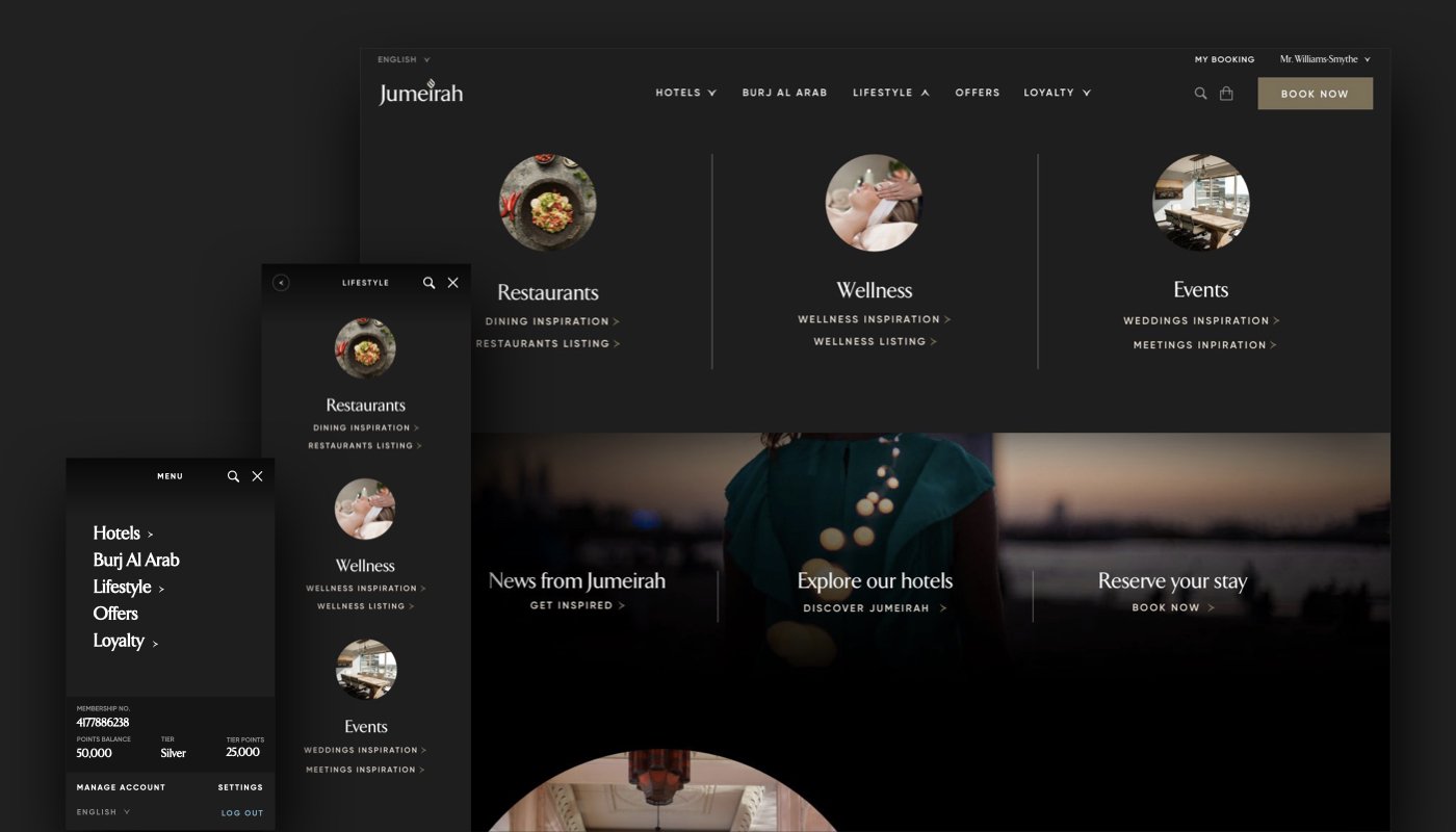
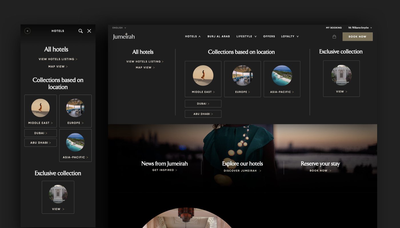
New navigation designs
Project Details
Prototypes preview: Mobile Website
Duration – 2 weeks
Team – me as product designer
My role – Gathering business requirements, reviewing Google Analytics data, doing competitors analysis, wireframing, designing 2 different solutions, prototyping and running user testing
Tools – Sketch, InVision, Principle, Guerrilla user testing
Deliverable – Redesign of Jumeirah’s site navigation for desktop and mobile
Competitors Analysis
After reviewing direct and indirect competitors within the luxury industry, few clear patterns emerged:
• Average navigation had 5-6 links
• Dropdowns revealed secondary links
• Secondary navigation contained more complex layouts and visuals
Information Architecture
New two-level navigation provided clearer content categorisation. It enabled users to navigate to a region or city specific hotels page from a secondary navigation level.
Sketches
Sketches based on new two-level IA map.
Leaner Navigation UI Concept
Custom Mega Nav Concept
Easy access to secondary links
Accommodates a great number of links
Best for accessible web design
This concept was user tested against the former site navigation. Users were asked to find specific features and they performed the tasks much faster using new navigation.
Design Iteration
Links were grouped based on the collection type
Region images were made clickable
Links UI were made dependent on the information hierarchy


