


Project Details
Duration – 2-3 months
Team – 3 software engineers, 1 product owner, 1 data team member and me
My role – End-to-end: from research, and ideation to final designs handover to engineers
Tools – Figma, Metro retro, Miro, Principle
Deliverable – Continuous education (CE) courses aggregator on the vTail app
Project Objective
Offer clinicians a consolidated resource of accredited CE courses.
Out of scope
Hosting vTail own courses
Integration with course host websites
Web solution
Project kick-off with stakeholders
We ran stakeholders workshop to get aligned on the project problem statement, and scope and gather as much knowledge from the stakeholders with a set of questions addressing user types and needs. Also, stakeholders' involvement in early project stages paved a smoother road for the design process ahead.
We ideated on the following questions:
1. How might we inform clinicians about this tool (CE aggregator) and get them to try it?
2. What are all possible ways a clinician will want to discover a course?
3. Which bits of information about the course are important (when clinicians are browsing)?
Screenshot of the workshop board on Metro Retro
During the session we all brainstormed and grouped ideas into the following themes:
1. Price/Cost (free vs paid)
2. Topic/Area of specialisation
3. Online vs In-person
4. Credit courses
5. Recommend courses (key opinion leaders, vTail, social proof)
6. Starting date
7. Location
8. Courses sponsored/provided by company X
9. Courses related to product X
Research

Survey
We sent a survey to vTail users to validate 7 prioritised ideas that came out from the workshop with stakeholders.
Survey results:
#1 Topic (by both AOS)
#2 In-person vs online (by both AOS)
#3 Location (by dental AOS)
#3 Free vs paid (by wound care AOS)
The above items were prioritised as primary browsing methods in later designs.


User interviews
Qualitative research has been conducted with 4 users based on the following objectives:
Understand how clinicians get their CE credits now.
Identify the pain points the clinicians come across when finding CE training.
Evaluate how easy is to discover courses on CE designs
Insights:
A known speaker is one of the most important indicators for choosing a course. (4/4 users)
Action point: prioritise speaker information across different user flow stages: from providing the speaker name when browsing all courses to giving more information on the speaker bio before a user decides to sign up for a course.
A pain point of CE courses might be driven by commercial rather than educational goals on the vTail platform. (2/4 users)
Action point: treat sponsored courses with informational and not promotional UI so that users are not put off by them.
Since covid started users switched to online training whereas before it was face-to-face. (3/4 users)
No action point. It's rather a validation of users' need for online learning methods based on habit changes since covid pandemic.
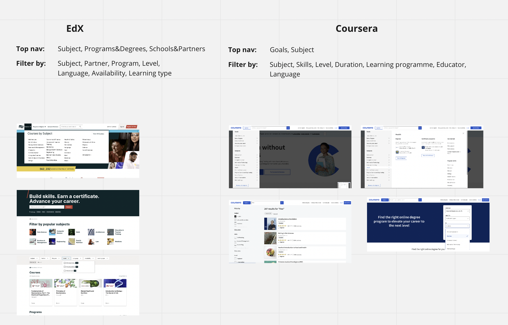
Indirect competitor analysis
I looked at ed-tech websites and native apps to better understand what course browsing methods they offer to users.
Insights
Course subject was within top primary navigation (4/5 indirect competitors)
Filters included:
Subject/topic (5/5)
Level (4/5)
Availability/start date (2/5)
Duration/resource length (3/5)
Price/subscription type (2/5)
Language (3/5)


CE home screen wireframes
I spent a lot of time on CE home screen ideas in particular as this was the anchoring place for users to explore all the available courses. It was important to offer an overview of courses breath without overwhelming the user.

Mixed filters concept
This concept enables to filter a list of all available courses in 2 key ways: primarily by selecting a course topic, and secondary by selecting tabs. Users can further narrow down the course list with tertiary filters.

Chips concept
This concept enables to filter a list of courses by visually equal filters: topic and price.

Carousel concept
This concept has been selected for further design process based on the following reasons:
Personalisation - IA allows a lot of personalisation as course carousels can be re-used to address specific user profiles and business requirements. We could offer CE courses that would feel curated for each user. Also, after the launch, relevant courses could be pushed based on previous browsing data.
Visual overview: carousels sections offer a good visual overview of the most valuable ways to browse courses
Reduced friction: not much input is required from users to access different course types. Horizontally scrollable course cards would essentially work as filters surfaced on the screen.
Scalability for future requirements: carousel component can be re-used if new browsing methods are identified as valuable to the user.
Other key screen wireframes
High-fidelity designs for user testing
Two high-fidelity design options were produced with option A being user tested with 4 users.
User testing learnings
People easily identified how to access more information about the course (3/3 users)
Action point: No identified need to introduce ‘See more details’ CTA on a course card.
Speakers section with courses from known dentists would be valuable (2/3 users)
Action point: Consider introducing a speaker carousel after launch once we gathered data on the most popular speakers.
Uncertainty if course credits meet accreditation requirements for different specialisations
Action point: Assure that the courses count towards medical accreditation.
Wants assurance that the courses are targeted for a specific user’s role.
Action points:
Introduce a carousel section with courses targeting specific role
By default, all displayed courses are targeting user’s role and introduce a separate carousel section for the courses targeting other roles
Designs iteration based on learnings
High-fidelity designs of other screens

Filtering topics listing screen

Filtering courses listing screen
Course global search flow
Animation created for the engineers to illustrate scrolling interactions
Animation was created using Principle software